
Submitted by ![]() Qwertie
Qwertie
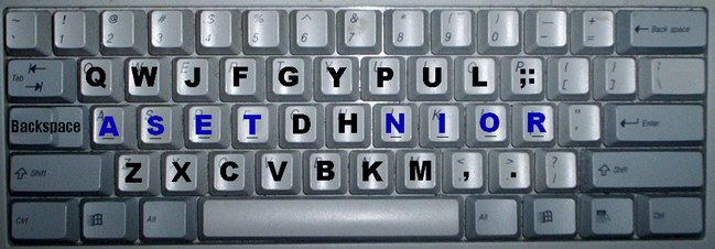
Asset is a keyboard designed to be easy-to-learn for Qwerty users, while perhaps improving typing speed beyond what Dvorak's potential. It can be remapped in software, so it could be used with any existing ergonomic or standard keyboard. It is primarily designed for English, and would probably work well in other languages given small changes.
- The ten most common letters of English are on home row (ASETDHNOIR). Using a literature corpus, and ignoring spaces, I found that these 10 comprise 69.8% of all characters.
- All punctuation and numbers stay in the same place except the ;: key.
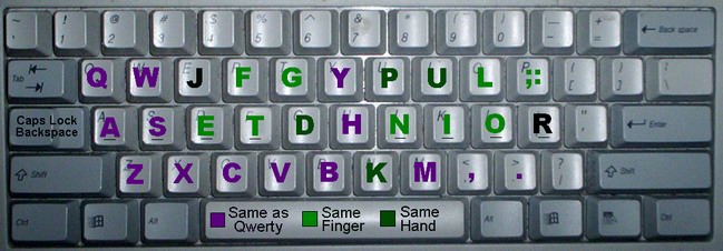
- My personal experience suggests that the brain learns hand assignments separately from finger assignments. Therefore, if only the finger is reassigned, learning is easier. In Asset, all letters are typed by the same hand except "R". Qwerty is imbalanced; I found that 55.3% of characters are typed by the left hand (in order by frequency, ETASRDCWGFBVX!QZ1), versus 44.7% for the right (in order,OINHLUMYP,.K"'-?J;). After "R" is moved, the keyboard is balanced (50.1% to 49.9%).
- 12 letters stay in their original Qwerty positions (ABHMPQSUVWXY).
- 11 more are pressed with the same finger (CEFGIJKLNOT), and 2 of the last 3 with the same hand.
- Asset removes Qwerty's most major same-finger digraph contention, namely ED/DE.
- The Qwerty Caps Lock key is replaced with Backspace, so you don't have to leave home row to correct yourself. I recommend that Caps Lock be toggled by Shift+Backspace, but other good positions include the right Windows key or Scroll Lock. The original Backspace key remains in place, because old habits die hard!
I would recommend the following for a hardware implementation of Asset, or for that matter, any other keyboard layout:
- The bottom row of the standard keyboard is misaligned. When your fingers are on home row and you move them down, they end up between the keys below, which makes the intended key harder to press. I believe these keys should be moved left by about 1/4 the width of a key. This will improve alignment for touch typing while not excessively annoying those used to the original alignment.
- The top row is also misaligned. This can be realized by noting that the left hand must turn toward the outside of the body while the right hand turns toward the inside; obviously the design is not related to the shape of our hands. A simple solution would be to align the two rows squarely by moving the upper row by 1/4 key to the right; more elaborate solutions can be left to ergonomics experts.
Of course, the last two considerations are not specific to Asset and could be offered by any manufacturer of any layout.
Asset could be implemented as a hardware switch. If such a switch were become a standard feature, people would be more willing to switch to Asset because they could rest assured that the layout is available on public terminals and friends' computers. On the other hand, of course, if Microsoft and Apple were to support the layout in their OSs, the same effect could be achieved.
Asset home: http://millikeys.sourceforge.net/asset/
Top designers | All designers | Design yours! | Send money | Rules